Lesson Six: layers, red eye removal, improving skin tones.
I. Layers
We've been making a shocking carnage with our images,
mucking about perhaps a desperate level of hopeless degradation, after which
only a thorough cleansing (choose Step Backward under File menu, or use the History panel)
can bring us back to some sort of pristine original. Better would it not be
to muck about on a crystal sheet of clear acetate hovering above our image? Messy
failings can merely be whisked away, and the original image remains unsullied. Such is the principle of
layers, as introduced in
Lesson Five. Let's delve further here.
Geezer note: Some of us remember in grade school those serious-minded
books describing "the human body," in which several layers of plastic
with important bones, glands, organs, hair and zits could be superimposed on
layers one at a time to complete the whole lurid picture. Similarly, we can
set up layers collect strange bits of pictures into one composite image, or
work with one detail of an image without disturbing others.

1. Save these practice images from the Photoshop practice photos file:
Limerick.jpg;
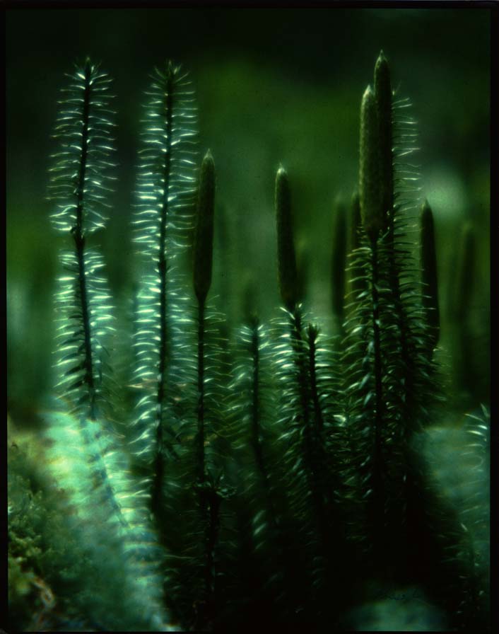
Clubmoss.jpg;
Dijon.jpg.
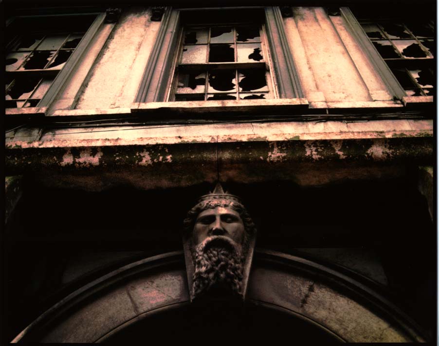
2. Open Limerick, then Clubmoss. The plan is to copy and paste that bearded Irish
stone head into the moss--and make it ghostly. (Illustration on right. Vaguely ghostly, no?)
3. Zoom in on head image to about 200% so that you can accurately select the head with the
Lasso tool or
Quick Selection tool.
Remember: To add or subtract pixels from your selection for a
perfect copy,
hold down the Option key (to subtract) or Shift Key (to add), and
circle with the Lasso tool or drag with the Quick Selection tool what
you want to add or delete.
From the
Select pulldown, choose
Refine Edge. In the dialogue box, adjust the
Feather slider to about
5 pixels. This gives you a softer blend between images.
4.
Zoom back out so that both club moss and Limerick are at 100 percent screen view size. Now click on the
Arrange Documents icon at top menu bar. Choose the
2-up icon so you can compare both photos at the same time. This gives you
an idea of how well your head will fit into the moss. As you can see, the head is a little
small. Using the Image Size command, chop pixels off your club moss (make the
image smaller) until the result looks more in perspective to the head.
5. To move the head, choose
Copy and
Paste, Cut and Paste, or with the
Move tool just
drag and
drop from one image to the other. If
it's not precisely placed, use the arrow keys to nudge pixel by pixel.
(Note
that Copy and Paste or drag and drop keep your original image intact,
which you usually want.) The head will drop onto a new layer
automatically created by Photoshop.
6. Likely the head will be a bit big or small. From the
Edit menu, choose
Transform and
Scale. Try
Distort or
Warp also to add a more spirit-like look. Note that dragging to enlarge
can pixellate a low-res image, so use this feature sparingly. Double-click on the
image (or Return key) to accept the changes.
7. Under Window pulldown, choose
Show Layers (if the Layers panel isn't already open). Yep, the head's
a new layer all right, likely called Layer 1. The layer you're currently working on will be highlighted.
You can move or change anything on this layer without affecting the rest of
the image. Click to choose other layers to work on. The panel will always
show a background layer. The eye means the
layer is visible--to make it temporarily invisible, toggle off at the eye. Layers
are displayed on the panel in the order they appear on your image--top in
the panel is top in the image.
Note: You can't work on a layer that's not highlighted in the panel--the
droll failing of drippy debutantes, which you're not. Right? (But I guess I am. I forget this all the time....)
Choose
Layer Properties from the flyout menu on the Layers panel. Name the layer something nifty like
"ghostly man," if you want. In the Layers panel choose Opacity of
about 60 percent. See how the head looks, well, slightly more ghostly.
10. Cool, yes, but could be cooler. Put opacity back to 100 percent. Then, on the Layers panel, scroll down the
blend mode options menu (
Normal is shown), and select
Multiply. This burns your image into other layers, giving
you a darker version. To blend into a lighter version, choose
Screen (see illustration). Or try
Lighten or
Darken. Or, for something completely eerie,
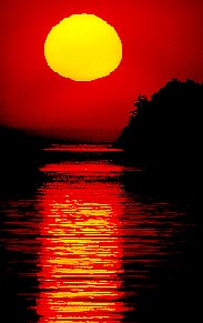
choose
Difference. This gives you a negative version of an image. Note: you
can't apply more than one blend mode at a time, though you can mix blends and
opacity.

11. You can paint inside a selection without first having to carefully marquee
around it, by toggling on the Layer panel's first Lock option,
Lock Transparent Pixels. This limits your painting to only
the image area, like spreading glue on a spot, then spreading the glitter. Except
that was a lot messier, made Mom mad, and therefore was a lot more fun. (See painted yellow hat on illustration.)
12. Wait! Not done yet. These Dali-esque images take time, you know.
Don't know who Salvador Dali was? Check this out.
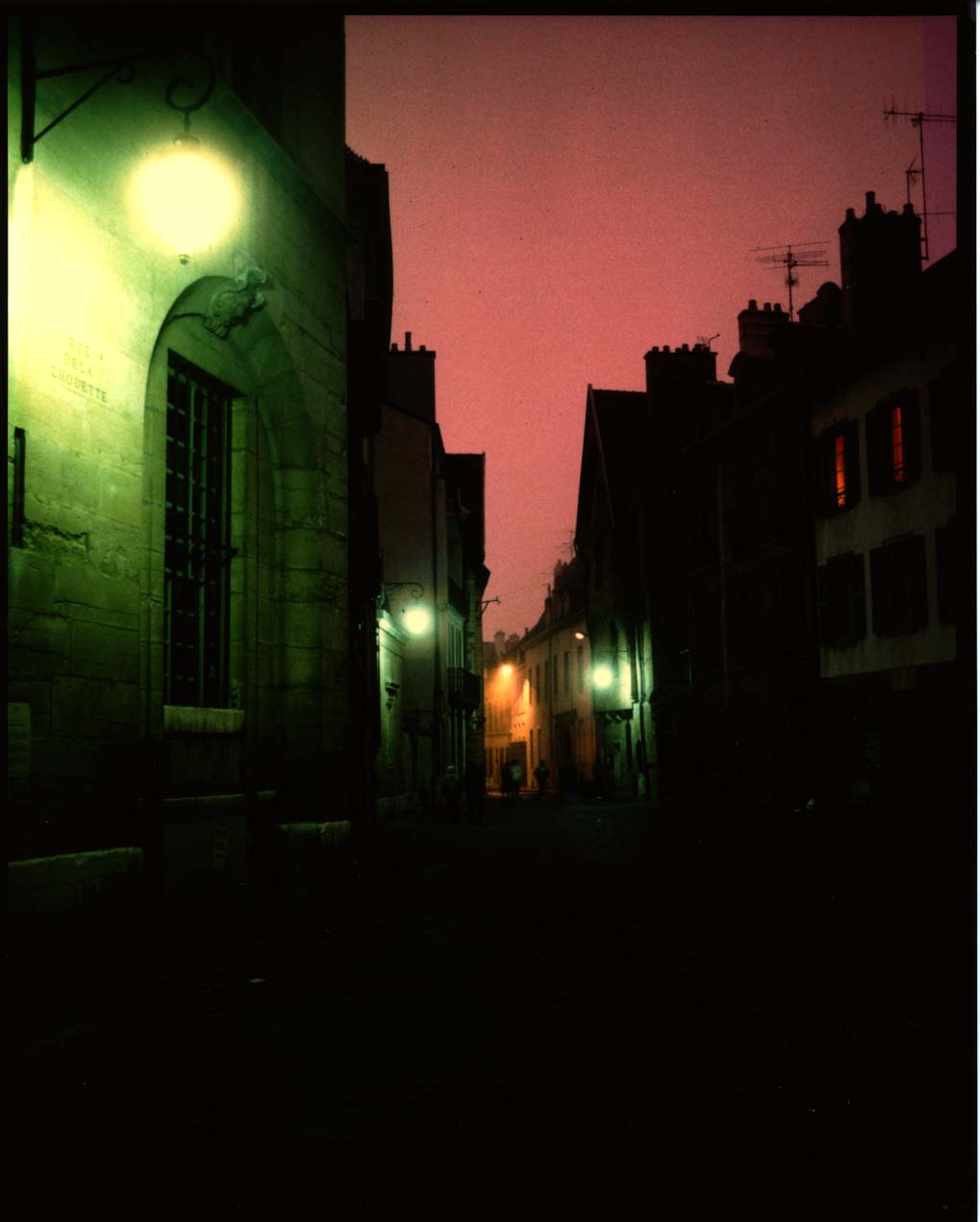
Open Dijon.jpg,
a rather ghostly street in the medieval French town which gave the world the
yellow condiment. Arrange to 3-Up so you can see all views at once.
Geezer's full disclosure: I lived in Dijon for six months. Don't ask me about mustard.
Maybe we could enhance our composite by adding a sort of dungeon
from which Monsieur Creepée could emerge into the club moss forest.
The window
and lamp at the left of look fairly dungeon-esque. First reduce the
image size to a better fitting dungeon lair. Then marquee. Refine edges,
and copy. Paste into the composite image.
13. Change opacity or blends on this new layer as necessary for better effect.
14. If those are still pretty hard edges on the right of the "dungeon," here's another softening method. Try choosing the
Eraser tool,
Airbrush Mode from top menu bar, Reduce
Opacity and
Flow
as necessary. Erase the hard edges to help the background show through.
Or try the Smudge or Blur tool. You're the graphic artist, after
all, not me. So why am I choosing your tools for you?
Note: This layer thing can be done just about to
infinity--up to 8,000 layers. However, layers hog computer memory. You
don't have enough for
8,000 layers, believe me. Or even 1,000. Or, in an NDSU cluster,
even three.
Or so it seems, sometimes.

15. You can save this as a Photoshop document, and
preserve your layers. If
you save it in most other formats, the layers flatten. After saving as a Photoshop
document, you can save a copy as a jpg (or other format), using the
Save As... command.
16. Working with many layers creates large files and can slow down your computer
operation. You may wish to
merge layers to speed things up. To do so, hide all
layers you don't want to merge by toggling off the eyeball in the Layers panel.
Then, from Layers pull-down menu, choose
Merge Down. Or choose
Flatten Image if you want to get rid of all the layers for good, but that'll be the end to
your fun and games with separate body parts
II. Fixing the dreaded red
Of the sundry problems the amateur's point-and-shoot photo leaves for the hapless
Photoshop pixel-pusher to fix is called
red eye. That is, pupils of people's
eyes look an ugly red, or pink.
Egghead's note: This happens, in case you're interested in the
vaguely disconcerting explanation, because when the light is dim pupils dilate so that we can
see better--like a camera lens aperture "wide open." Unfortunately,
that leaves our retinas wide open to invasion of a brief burst of intensely
bright flash. We victims blink and wait to get our sight back after that mean trick temporarily
blinds us (hey, says the eye, the light was supposed to be dim!). The flash
has actually reflected off the blood-engorged back of our retina (that was the
disconcerting part), and directly back into the camera. Hence, red eye.


Okay,
but how to fix? Used to have to work with the Clone tool, or paint in
black pupils. Tricky. We now have something called the
Color Replacement
tool. This is sooooooo easy:
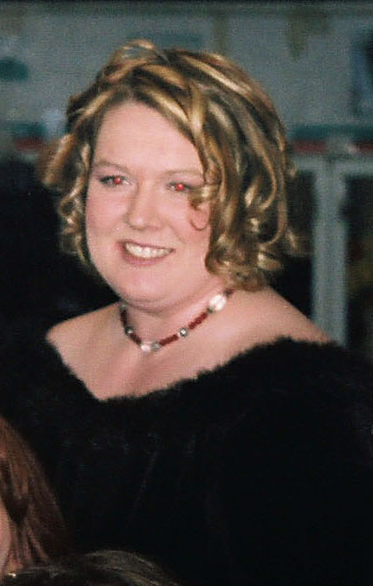
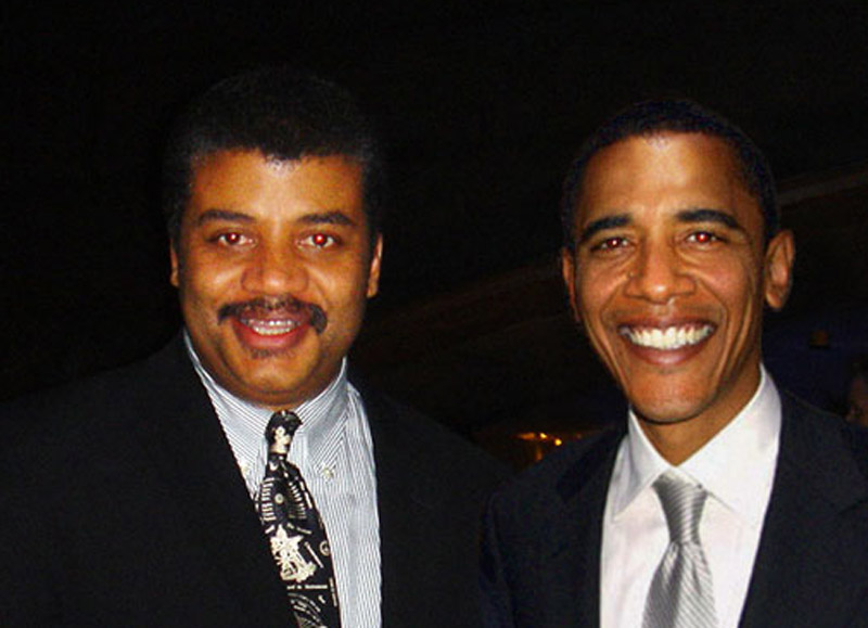
1.Download and open this
dreadful photo (or this
dreadful photo) needing attention. Heck, I've seen a pile of 'em in student projects. Choose the
Red Eye tool under the Healing Brush in the toolbox.
2. Find the offending eye. Zoom in for a better view.
3. Click the tool on the red eye. Tah-dah, maybe. If you're not
satisfied, undo, change pupil size and darken size, keep trying.
Geezer warning: In the future, if I
see any red-eye photos in your pictures and designs, automatic F! Even
if you've already graduated! You can't hide from us old professors, you
know.
III. Nip & tuck one: basic skin tones.


We already learned how to remove scars and blemishes. But people with
slightly reddish, blotchy, pimply skin won't be enthusiastic to see
their flaws emphasized in digital photos. Unfortunately, digital systems
tend to emphasize these, particularly when the unfortunate is
photographed with flash on camera. I don't believe it's lying to soften
unflattering skin tones that the unforgiving pixels have made harsher.
And here's a fairly easy way to do it. (Based on a tutorial by
Lee Varis in
Macworld, March 2007).
(Right: original and improved red eye and skin tones.)
1.
Download this photo, or a similar one with skin problems.
Fix the red eye,
using technique above. This man also really needs some work on that
reddish skin, although in this case he apparently doesn't have to worry
much about acne blemishes. But this technique below works well for
people with those problems as well.
2. Open a
New Adjustment Layer from the Layer pulldown,
Hue/Saturation.
A reminder on Adjustment Layers: While you can make adjustments
on the actual picture from the Adjustments options in the Image
pulldown, it's safer to make changes on a separate Adjustment Layer. If
those changes don't work out the way you want, just throw away the
layer--drag it to the trash icon in the Layers panel--and start over.
Otherwise, you'll have to go back using the History panel.
3. The Hue/Saturation panel emerges at right. From the "Master" flyout, choose
Reds.
4. Select the
left eyedropper (bottom left) if not already. Find a really red area or pimple. Click. Note the gray bar in the color bars at bottom indicates sample area.

5. Now select the
minus eyedropper tool, on the right. Click on a nicer-looking area of skin color.
6. To check to see what area of skin will be affected, slide the
Hue
slider all the way to the left. The cyan areas indicate what part of
the image will be changed. If you want to make the affected area less,
slide the right corner of the gray bar to the left.
7. Slide the hue slider back to 0, and then over toward the yellow/green, until the skin looks good.
8. Try moving the
Lightness slider a little to the right to get a more uniform skin tone.
(Illustration right: the hue/saturation dialogue box on adjustment layer.)
9. If some areas are too yellow, clean that up; choose
Yellows.
Use left eyedropper tool to select area that's too yellow. Then use
minus eyedropper tool to select red areas, now cleared to more natural
skin tone. Move the hue slider to the right to make yellow areas a
little more reddish.
10. Should be much better! Sometimes lots of pimples, lines or
blemishes will still show up a bit darkish. You can lighten them with
the dodge tool on the background layer.
Submit for grading by email attachment to me,
ross.collins@ndsu.edu: 1. Your creepy man composite. 2. Your skin-tone fix. Note: To submit,
Save as to a jpg. Don't submit the much larger psd (Photoshop) file.
IV. Nipping & tuck two: digital plastic surgery.
This tutorial shows you how to really work on body parts. For 2 pts. extra credit, work through tutorial and submit photo.
 You
may wish to delete a background and replace it with nothing--that is,
create a transparent background. Or you may wish to delete a background
and fill it with something else. Both begin the same way.
You
may wish to delete a background and replace it with nothing--that is,
create a transparent background. Or you may wish to delete a background
and fill it with something else. Both begin the same way. II. Background is cluttered.
 7. When you're ready, choose Delete. Deselect.
 Consider the photo at left. Now this person probably will not like the way she looks on the beach. Who would?
 8. We need to deal with the folds of skin. Try the Patch Tool
(might be under the Healing Brush). Choose an area you'd like to
remove, such as the skinfold. Click in the middle of that area, drag to
an area you'd like to replace it with, such as clear skin above that
area.
8. We need to deal with the folds of skin. Try the Patch Tool
(might be under the Healing Brush). Choose an area you'd like to
remove, such as the skinfold. Click in the middle of that area, drag to
an area you'd like to replace it with, such as clear skin above that
area.


 b.
Change your foreground color to something that matches the rest of your
photos. One option is to use the Eyedropper tool to sample from an
actual photo, and save that to your swatches panel. To do that, with the
Eyedropper tool click on the color, go to the Swatches panel, Choose
New Color from the flyout menu at right.
b.
Change your foreground color to something that matches the rest of your
photos. One option is to use the Eyedropper tool to sample from an
actual photo, and save that to your swatches panel. To do that, with the
Eyedropper tool click on the color, go to the Swatches panel, Choose
New Color from the flyout menu at right. c. Or choose a color from the Color Picker (click on the foreground icon at bottom of toolbox).
 4. One you have everything ready, choose Output from the top right. Choose the PDF icon.
 7. Toggle off Use Auto Spacing and space as you wish. You can try my numbers for starters, see left.
 19.
Add a polished look by putting a border around each of your photos.
First, duplicate your image layer by choosing that layer in the panel
and then choosing Duplicate Layer from the flyout or from the Layers pulldown at top.
19.
Add a polished look by putting a border around each of your photos.
First, duplicate your image layer by choosing that layer in the panel
and then choosing Duplicate Layer from the flyout or from the Layers pulldown at top. 25. Save as a Photoshop pdf--or as a tiff, depending on how you'll output your poster.
 1.
Open your first photo for the montage. This will serve as your
background photo; other photos will blend into this. Ideally the photo
should have space around the center of interest to make the blend work.
Use Image Size to make the photos the size and resolution you need.
1.
Open your first photo for the montage. This will serve as your
background photo; other photos will blend into this. Ideally the photo
should have space around the center of interest to make the blend work.
Use Image Size to make the photos the size and resolution you need. 2. Open your second montage photo. Crop as necessary, and size so that it fits into the background photo as you need.
 8. Drag
horizontally on the second photo to smoothly blend the second photo
with the first. You may have to experiment with this a bit to get it
just right. Use the Command-z keystroke combination to go back.
8. Drag
horizontally on the second photo to smoothly blend the second photo
with the first. You may have to experiment with this a bit to get it
just right. Use the Command-z keystroke combination to go back. 9.
When you're ready open the third picture. Same procedure: size, crop,
copy, paste into your montage. Move, Layer Mask, gradient.
9.
When you're ready open the third picture. Same procedure: size, crop,
copy, paste into your montage. Move, Layer Mask, gradient. 12. With the chosen layer mask active (click on it from the layers panel), paint over the image to blend. Adjust hardness and opacity of brush as necessary.
 2. Choose the Horizontal Type Tool (big solid T) from the toolbox.
  4. Choose an appropriate font and type size and type "North Country Canoeing." Change to a a lighter color in the Colors or Swatches panel (If not showing, go to Window pulldown, Show Color or Swatches).
  7. Decide you don't want some text? You can delete
the letters, but better to just delete that layer. Drag it to the
little trash can icon at the bottom right of the Layers panel.
7. Decide you don't want some text? You can delete
the letters, but better to just delete that layer. Drag it to the
little trash can icon at the bottom right of the Layers panel. 
 10. Now choose the Gradient tool
(it might be under the Paint Bucket). With Radial Gradient chosen
(first icon at top), drag over type from middle to right to see sunburst
effect (you may wish to change foreground and background colors). When
ready, choose Deselect (Apple+ d). Choose the Move tool (upper right)
and drag the rainbox text to bottom center.
10. Now choose the Gradient tool
(it might be under the Paint Bucket). With Radial Gradient chosen
(first icon at top), drag over type from middle to right to see sunburst
effect (you may wish to change foreground and background colors). When
ready, choose Deselect (Apple+ d). Choose the Move tool (upper right)
and drag the rainbox text to bottom center.  8.
Note: you may have to adjust image size of your photo before Copying
and Pasting Into, so that proportions look right. Of course, you can
also Paste a photo into text written into another photo.
8.
Note: you may have to adjust image size of your photo before Copying
and Pasting Into, so that proportions look right. Of course, you can
also Paste a photo into text written into another photo.  I. Cutting and Cloning
 This
time instead of deleting an object, we moved it. Now it's time to fill
in the background. You might find this one more challenging with the
clone stamp, because the red background is not uniform, but many shades.
This
time instead of deleting an object, we moved it. Now it's time to fill
in the background. You might find this one more challenging with the
clone stamp, because the red background is not uniform, but many shades. By now you've probably already clicked on one of the boxes. Did I give you permission
to do that? See what you've done now? A hideously complex Color Picker explodes
onto the screen. You may wish to pick through the options of this Picker. I
don't pick the Picker. If, on the other hand, you want to learn what I think
is an easier alternative, Cancel and forge on. (Illustration: color picker, right of image, vs. color panel, far right panel.)
By now you've probably already clicked on one of the boxes. Did I give you permission
to do that? See what you've done now? A hideously complex Color Picker explodes
onto the screen. You may wish to pick through the options of this Picker. I
don't pick the Picker. If, on the other hand, you want to learn what I think
is an easier alternative, Cancel and forge on. (Illustration: color picker, right of image, vs. color panel, far right panel.) 1. Select the sun, as above.
 That's where some people decide they'll never use this stupid tool again. But
we smart designers know there's a lot more to the tool than that. Let's investigate.
That's where some people decide they'll never use this stupid tool again. But
we smart designers know there's a lot more to the tool than that. Let's investigate.