Friday, November 8, 2013

Photoshop Lesson Nine (Deleting backgrounds, replacing backgrounds)

Deleting backgrounds.
This is incredibly handy for magazine cover design, when you need a transparent background. And Photoshop gives you more than one way to do it, of course. Here are two methods.
Deleting backgrounds in Photoshop.You may wish to delete a background and replace it with nothing--that is, create a transparent background. Or you may wish to delete a background and fill it with something else. Both begin the same way.
You can do this exercise with your own photos, or choose these:
remove background.
replacement background.
I. The background is nearly monochromatic.
If your background is pretty much the same color, you can just erase it.
1. Create a Duplicate the background layer from the Layers pulldown or the flyout menu at right of Layers panel.
2. Turn off the original background layer from the Layers panel by toggling off the eye icon.
3. Choose the Background Eraser from the toolbox.
4. Set the tolerance in the contextual menu at top as necessary. Start with about 25 percent.
5. Set the cursor size as necessary (use the bracket keys as a shortcut, [ and ]) and click and/or drag to erase background. You may have to adjust cursor size and tolerance several times. Begin with a large size Background Eraser.
6. To repair areas of your image you want to keep, Choose the Eraser Tool. Toggle on Erase to Background. Erase the areas to bring back the image. Clean up background by dragging Background Eraser. (Use keystroke command to zoom in or out: Command and + or - keys.)
7. You can replace a background, if you wish. Choose a photo, Open. Copy.
8. Choose New Layer from Layer pulldown or panel flyout. Paste the image onto that new layer.
9. In the Layers panel drag the background copy layer up--this puts that layer above the other layer.
9. Scale the image to fit by choosing Transform, and Scale from the Edit pulldown.
10. Working on the background copy layer, clean up background, if necssary. Use the Command-z keystroke to go back, if necessary. Yes, I know this takes a deft touch. Mousing precisely is a skill....
11. Save as jpg.
Cluttered background.II. Background is cluttered.
It's hard to do a good job with the Background Eraser in a colored background, because it looks for similar colors to select. So let's try a Quick Mask instead.
1. Open photo in Photoshop. Duplicate background layer, and work from background copy layer. Toggle off view of original background layer, as above.
2. Choose Quick Mask mode from bottom of toolbox.
3. Choose the Brush Tool. Choose a hard edged brush.
4. Brush in the image area you want to keep. Note it will change to a ruby red as it's masked. Try to do your best, but it doesn't have to be perfect.
5. Click off Quick Mask mode. The ruby area turns to a selection.
6. Adjust your selection more accurately using the Lasso Tool. Choose the second option (minus selection) to select areas of the mask you want to add, or vice versa.
Photoshop quick mask.7. When you're ready, choose Delete. Deselect.
8. If you want to delete the foreground instead of the background, choose Inverse from the Select pulldown, and Delete.
9. If you wish, add another background as explained above.

Photohop Lesson Eight (Nip and tuck)

Nip & Tuck Two: Digital plastic surgery.
By Ross Collins, North Dakota State University
This tutorial is based on a YouTube video feature. Check out Virtual Weight Loss in Photoshop.
To improve reddish skin tones, see Nip & Tuck Tutorial One.
Everybody knows nowadays that the models you see in fashion magazines aren't real. They're Photoshop Pholks: normal people with a few (or more) problems made perfect using Photoshop tools.
But what we might not know is how far we can take this. We can produce people who never existed, not even close. One way is to reduce our increasingly obese American society. Photoshop weight reduction won't give us better physical health. (For that, see Ross's Fargo Fit pages.) But it might give us better mental health, as we are spared the pain of seeing how we really look in photos.
Beach body before.
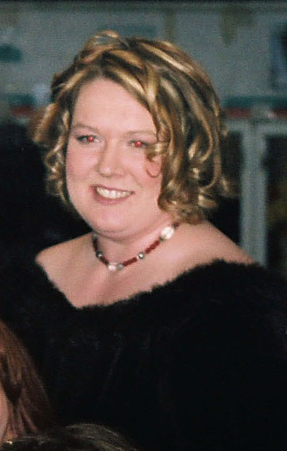
Consider the photo at left. Now this person probably will not like the way she looks on the beach. Who would?
Well, we can fix that. And the surprising tool that we'll use is the Liquify Filter.
1. Download this photo and open in Photoshop. Crop as necessary.
2. Choose Liquify from the Filter pulldown.
3. Zoom into the middle section. Note in liquify you can zoom by dragging with the Command key held down. You can adjust by clicking on plus and minus tabs at bottom left.
4. The liquify dialogue box and tools will appear. Choose the first tool (Forward Warp) if not chosen by default. Adjust brush size and other features on right.
5. Push on the midsection with the tool to reduce. Note you can use this tool also to slim the legs and arms and adjust to look natural. Understanding a little anatomy here helps.
6. Reduce inside areas (such as the, um, rear end), by choosing the Pinch Tool and clicking inside.
7. When you're ready, choose Done to save your work. (It's a good idea to save in several stages, because the History Panel doesn't let you go back to stages before Liquify.)
Patch tool.8. We need to deal with the folds of skin. Try the Patch Tool (might be under the Healing Brush). Choose an area you'd like to remove, such as the skinfold. Click in the middle of that area, drag to an area you'd like to replace it with, such as clear skin above that area.
9. Work with the Smudge Tool if necessary to smooth out blotches.
10. For more complicated areas, choose the Clone Stamp Tool. Option key + click on a clear area you'd like to clone. Without holding down the mouse button (CS5), drag the mouse over the area you'd like to fix. Click to accept the clone.
11. With just a few minutes' work, you can create a new person! See below for the before, during and after photos. And with a little more time, you can improve skin, and adjust proportions to make it perfect.
Photoshop liquify before and after.
Below we've continued to improve our reddish award winner: fixed red eye, removed blemishes, improved skin tones, slimmed down face. The nose also seemed to be a little big, and the hair needed some smoothing.... Same person? Mmm....
12. Last warning: This work is considered unethical in photojournalism!
Reddish winner nip and tuck.

Photoshop Lesson Seven(b) (Create a poster)


Photo poster.

Create a Poster!

(And see below to create a Web photo gallery.)
What self-respecting photojournalist wouldn't want a poster of her or his work? Fame and fortune will likely follow. Well, here's an easy way to make a professional-looking poster. It's based on a tutorial from the indefatigable Scott Kelby.
This poster uses both Bridge and Photoshop. It does work best with photos all in the same format, but if that doesn't work for you, feel free to use whatever you like best.
1. You may wish to make a title image for your poster collection, as used in the bottom right of the poster above. To do so
a. Open one of the photos you plan to use, so that your title image is the same size.
New swatch.b. Change your foreground color to something that matches the rest of your photos. One option is to use the Eyedropper tool to sample from an actual photo, and save that to your swatches panel. To do that, with the Eyedropper tool click on the color, go to the Swatches panel, Choose New Color from the flyout menu at right.
Title image.c. Or choose a color from the Color Picker (click on the foreground icon at bottom of toolbox).
d. Choose the keystroke combination Option-Delete (PC: Alt-Backspace) to replace the background layer with the color.
e. Be sure to Save As to a new filename, so you don't wreck your picture!
f. Click the Type tool in the colored box. Choose a font and a color. (See Tutorial Five, Working with Type.) I wrote "Winter," and in a separate layer added my web URL underneath.
g. Save as JPEG in the same folder as your other poster images.
2. Open the folder of your poster photos in Bridge.
3. Drag to arrange photos. Title image is usually last.
Output panel in Bridge.4. One you have everything ready, choose Output from the top right. Choose the PDF icon.
5. In the Document area (see right), choose a Width and Height as you need. Many posters are 12 inches by 18 inches. I choose 11.5 by 17 to leave some margin along the edge, but it depends on how you plan to output the poster. I leave everything else in the Document area as default.
6. In the Layout area, choose the number of rows and columns you'd like for your photos. As I have nine photos here, I decided to choose three columns and three rows.
Image size in Bridge.7. Toggle off Use Auto Spacing and space as you wish. You can try my numbers for starters, see left.
8. In the Overlays area, toggle off Filename. Otherwise your poster will include them. under each image.
9. Click in image area on left to choose the image you want to be first. Holding down the Shift key, click on last image to Select All.
10. If you don't like the arrangement of your images, click outside the image area to Deselect, and drag them in the bottom area until they work for you.
11. Select All again. Click Refresh Preview. You'll see your photos in pdf poster form.
12. When everything's perfect, again Select All the images at bottom, and choose Save from the bottom of the Output panel. Toggle on View PDF After Save if you want to see how it looks.
13. You could stop here with your poster pdf. But we're going to do a little more tweaking in Photoshop.
14. Open your pdf in Photoshop. When the pdf dialogue box comes up, choose Media Box from the Crop To flyout, so that you retain your original poster measurement. The default Bounding Box crops the image.
15. You have no background layer, but you'll need one. To fill those transparent pixels, go to the Layers panel, and create a New Layer from the flyout menu at right, or the icon at bottom.
16. Drag that new layer in the Layers panel until it's second in line, after your image layer. This puts the new layer underneath your image layer.
17. Choose a color for your poster's background from your Swatches panel, or click on the small overlapped square icons at bottom of tool box to revert to the default black and white.
18. Working in your new layer, fill with the background color or paint with the foreground color. To fill the background color, use the keystroke combination Command-Delete (PC: Alt-Backspace). To paint the foreground color, choose the Paint Bucket tool, and click in the layer.
Stroke dialogue box.19. Add a polished look by putting a border around each of your photos. First, duplicate your image layer by choosing that layer in the panel and then choosing Duplicate Layer from the flyout or from the Layers pulldown at top.
20. Working on that Layer copy, go to the Edit pulldown. Choose Stroke.
21. In the dialogue box, change the width to around 6 pixels, and the color to your choice. I chose black.
22. When you OK, borders will automatically be added to each photo.
23. Now for your final florish: your byline or title. Choose the Text tool. Click to add a new layer. Type and style as necessary.
24. If you like the sort of sophisticated look of extra space between each letter, it's better to add that from the Character panel (Windows pulldown). Select the type. In the tracking icon window, stretch space to about 250. I've also selected Small Caps from the Character panel flyout menu to give it that oh-so-polished look.
Poster signature.25. Save as a Photoshop pdf--or as a tiff, depending on how you'll output your poster.
26. Now ain't that cool.
Bonus! Create a Web photo gallery (Flash file).
1. Begin as above, with your chosen photos in their own file.
2. As above, choose Output. But instead of PDF, choose Web Gallery.
3. In the Site Info dialogue box, change information as necessary. Most of these are pretty self-explanatory.
4. At bottom is the Save. Save to a separate folder. This folder can be burned to a CD or uploaded to a website.
5. Here's an example, using the same photos as for the poster above.

Photoshop Lesson Seven (Create a montage)

Creating a montage

India montage.
Collages, or montages, as they are sometimes called, have become a standard of contemporary design. That's because they're so easy to do in Photoshop. Here's the directions for a simple montage using four photographs.
Montage image one.1. Open your first photo for the montage. This will serve as your background photo; other photos will blend into this. Ideally the photo should have space around the center of interest to make the blend work. Use Image Size to make the photos the size and resolution you need.
Montage image two.2. Open your second montage photo. Crop as necessary, and size so that it fits into the background photo as you need.
3. Using the marquee tool, drag around the second photo. Copy. (Alternatively, you can drag and drop the second photo into the first. Paste copied photo into background photo.
4. The second photo will be placed on top of the first on its own layer. Choose the move tool to move it as you want. Use the transform option (Edit pulldown) and Scale to fit the image to area desired in the original photo. Choose Return to accept transform.
5. In the Layers panel, choose the Add Layer Mask icon at bottom (the little circle icon).Layer Mask icon.
6. Choose the gradient tool from the Toolbox. (It might be behind the paint bucket tool).
7. In the foreground/background color icon, choose black to white (or white to black, if you want to fade to black).
Montage step three.8. Drag horizontally on the second photo to smoothly blend the second photo with the first. You may have to experiment with this a bit to get it just right. Use the Command-z keystroke combination to go back.
Montage step four.9. When you're ready open the third picture. Same procedure: size, crop, copy, paste into your montage. Move, Layer Mask, gradient.
10. Add a fourth picture, or more, if you wish.
11. You will have to adjust the sharp edges between photos. To do that, choose the brush tool. Choose a soft-edged brush, and set your foreground color to black.
Canoeing montage.12. With the chosen layer mask active (click on it from the layers panel), paint over the image to blend. Adjust hardness and opacity of brush as necessary.
13. Add text, if you wish.
14. Save as tif or jpg for publication or the Web.
Below are some practice photos, and a sample montage I'm sure you can improve on.
Wabakimi, Ontario, sunset.
Fisherman.
Canoes.
Canoe sailing.

Photoshop Lesson Six (Layers, red eye removal, improving skin tones)

Lesson Six: layers, red eye removal, improving skin tones.
I. Layers
We've been making a shocking carnage with our images, mucking about perhaps a desperate level of hopeless degradation, after which only a thorough cleansing (choose Step Backward under File menu, or use the History panel) can bring us back to some sort of pristine original. Better would it not be to muck about on a crystal sheet of clear acetate hovering above our image? Messy failings can merely be whisked away, and the original image remains unsullied. Such is the principle of layers, as introduced in Lesson Five. Let's delve further here.
Geezer note: Some of us remember in grade school those serious-minded books describing "the human body," in which several layers of plastic with important bones, glands, organs, hair and zits could be superimposed on layers one at a time to complete the whole lurid picture. Similarly, we can set up layers collect strange bits of pictures into one composite image, or work with one detail of an image without disturbing others.
layers example.1. Save these practice images from the Photoshop practice photos file: Limerick.jpg; Clubmoss.jpg; Dijon.jpg.

2. Open Limerick, then Clubmoss. The plan is to copy and paste that bearded Irish stone head into the moss--and make it ghostly. (Illustration on right. Vaguely ghostly, no?)

3. Zoom in on head image to about 200% so that you can accurately select the head with the Lasso tool or Quick Selection tool.
Remember: To add or subtract pixels from your selection for a perfect copy, hold down the Option key (to subtract) or Shift Key (to add), and circle with the Lasso tool or drag with the Quick Selection tool what you want to add or delete.
From the Select pulldown, choose Refine Edge. In the dialogue box, adjust the Feather slider to about 5 pixels. This gives you a softer blend between images.

4. Zoom back out so that both club moss and Limerick are at 100 percent screen view size. Now click on the Arrange Documents icon at top menu bar. Choose the 2-up icon so you can compare both photos at the same time. This gives you an idea of how well your head will fit into the moss. As you can see, the head is a little small. Using the Image Size command, chop pixels off your club moss (make the image smaller) until the result looks more in perspective to the head.

5. To move the head, choose Copy and Paste, Cut and Paste, or with the Move tool just drag and drop from one image to the other. If it's not precisely placed, use the arrow keys to nudge pixel by pixel. (Note that Copy and Paste or drag and drop keep your original image intact, which you usually want.) The head will drop onto a new layer automatically created by Photoshop.

6. Likely the head will be a bit big or small. From the Edit menu, choose Transform and Scale. Try Distort or Warp also to add a more spirit-like look. Note that dragging to enlarge can pixellate a low-res image, so use this feature sparingly. Double-click on the image (or Return key) to accept the changes.

7. Under Window pulldown, choose Show Layers (if the Layers panel isn't already open). Yep, the head's a new layer all right, likely called Layer 1. The layer you're currently working on will be highlighted. You can move or change anything on this layer without affecting the rest of the image. Click to choose other layers to work on. The panel will always show a background layer. The eye means the layer is visible--to make it temporarily invisible, toggle off at the eye. Layers are displayed on the panel in the order they appear on your image--top in the panel is top in the image.
Note: You can't work on a layer that's not highlighted in the panel--the droll failing of drippy debutantes, which you're not. Right? (But I guess I am. I forget this all the time....)
Choose Layer Properties from the flyout menu on the Layers panel. Name the layer something nifty like "ghostly man," if you want. In the Layers panel choose Opacity of about 60 percent. See how the head looks, well, slightly more ghostly.
10. Cool, yes, but could be cooler. Put opacity back to 100 percent. Then, on the Layers panel, scroll down the blend mode options menu (Normal is shown), and select Multiply. This burns your image into other layers, giving you a darker version. To blend into a lighter version, choose Screen (see illustration). Or try Lighten or Darken. Or, for something completely eerie, choose Difference. This gives you a negative version of an image. Note: you can't apply more than one blend mode at a time, though you can mix blends and opacity.

painting on a layer example.11. You can paint inside a selection without first having to carefully marquee around it, by toggling on the Layer panel's first Lock option, Lock Transparent Pixels. This limits your painting to only the image area, like spreading glue on a spot, then spreading the glitter. Except that was a lot messier, made Mom mad, and therefore was a lot more fun. (See painted yellow hat on illustration.)

12. Wait! Not done yet. These Dali-esque images take time, you know.
Don't know who Salvador Dali was? Check this out.
Open Dijon.jpg, a rather ghostly street in the medieval French town which gave the world the yellow condiment. Arrange to 3-Up so you can see all views at once.
Geezer's full disclosure: I lived in Dijon for six months. Don't ask me about mustard.
Maybe we could enhance our composite by adding a sort of dungeon from which Monsieur Creepée could emerge into the club moss forest. The window and lamp at the left of look fairly dungeon-esque. First reduce the image size to a better fitting dungeon lair. Then marquee. Refine edges, and copy. Paste into the composite image.
13. Change opacity or blends on this new layer as necessary for better effect.

14. If those are still pretty hard edges on the right of the "dungeon," here's another softening method. Try choosing the Eraser tool, Airbrush Mode from top menu bar, Reduce Opacity and Flow as necessary. Erase the hard edges to help the background show through. Or try the Smudge or Blur tool. You're the graphic artist, after all, not me. So why am I choosing your tools for you?
Note: This layer thing can be done just about to infinity--up to 8,000 layers. However, layers hog computer memory. You don't have enough for 8,000 layers, believe me. Or even 1,000. Or, in an NDSU cluster, even three. Or so it seems, sometimes.

Creepy man, three layers.15. You can save this as a Photoshop document, and preserve your layers. If you save it in most other formats, the layers flatten. After saving as a Photoshop document, you can save a copy as a jpg (or other format), using the Save As... command.

16. Working with many layers creates large files and can slow down your computer operation. You may wish to merge layers to speed things up. To do so, hide all layers you don't want to merge by toggling off the eyeball in the Layers panel. Then, from Layers pull-down menu, choose Merge Down. Or choose Flatten Image if you want to get rid of all the layers for good, but that'll be the end to your fun and games with separate body parts

II. Fixing the dreaded red
Of the sundry problems the amateur's point-and-shoot photo leaves for the hapless Photoshop pixel-pusher to fix is called red eye. That is, pupils of people's eyes look an ugly red, or pink.
Egghead's note: This happens, in case you're interested in the vaguely disconcerting explanation, because when the light is dim pupils dilate so that we can see better--like a camera lens aperture "wide open." Unfortunately, that leaves our retinas wide open to invasion of a brief burst of intensely bright flash. We victims blink and wait to get our sight back after that mean trick temporarily blinds us (hey, says the eye, the light was supposed to be dim!). The flash has actually reflected off the blood-engorged back of our retina (that was the disconcerting part), and directly back into the camera. Hence, red eye.
red eye replacement example.red eye replacement example.Okay, but how to fix? Used to have to work with the Clone tool, or paint in black pupils. Tricky. We now have something called the Color Replacement tool. This is sooooooo easy:
1.Download and open this dreadful photo (or this dreadful photo) needing attention. Heck, I've seen a pile of 'em in student projects. Choose the Red Eye tool under the Healing Brush in the toolbox.
2. Find the offending eye. Zoom in for a better view.
3. Click the tool on the red eye. Tah-dah, maybe. If you're not satisfied, undo, change pupil size and darken size, keep trying.
Geezer warning: In the future, if I see any red-eye photos in your pictures and designs, automatic F! Even if you've already graduated! You can't hide from us old professors, you know.
III. Nip & tuck one: basic skin tones.
skin tone example.skin tone example two.
We already learned how to remove scars and blemishes. But people with slightly reddish, blotchy, pimply skin won't be enthusiastic to see their flaws emphasized in digital photos. Unfortunately, digital systems tend to emphasize these, particularly when the unfortunate is photographed with flash on camera. I don't believe it's lying to soften unflattering skin tones that the unforgiving pixels have made harsher. And here's a fairly easy way to do it. (Based on a tutorial by Lee Varis in Macworld, March 2007).
(Right: original and improved red eye and skin tones.)
1. Download this photo, or a similar one with skin problems. Fix the red eye, using technique above. This man also really needs some work on that reddish skin, although in this case he apparently doesn't have to worry much about acne blemishes. But this technique below works well for people with those problems as well.
2. Open a New Adjustment Layer from the Layer pulldown, Hue/Saturation.
A reminder on Adjustment Layers: While you can make adjustments on the actual picture from the Adjustments options in the Image pulldown, it's safer to make changes on a separate Adjustment Layer. If those changes don't work out the way you want, just throw away the layer--drag it to the trash icon in the Layers panel--and start over. Otherwise, you'll have to go back using the History panel.
3. The Hue/Saturation panel emerges at right. From the "Master" flyout, choose Reds.
4. Select the left eyedropper (bottom left) if not already. Find a really red area or pimple. Click. Note the gray bar in the color bars at bottom indicates sample area.
skin improvement screen shot.5. Now select the minus eyedropper tool, on the right. Click on a nicer-looking area of skin color.
6. To check to see what area of skin will be affected, slide the Hue slider all the way to the left. The cyan areas indicate what part of the image will be changed. If you want to make the affected area less, slide the right corner of the gray bar to the left.
7. Slide the hue slider back to 0, and then over toward the yellow/green, until the skin looks good.
8. Try moving the Lightness slider a little to the right to get a more uniform skin tone.
(Illustration right: the hue/saturation dialogue box on adjustment layer.)
9. If some areas are too yellow, clean that up; choose Yellows. Use left eyedropper tool to select area that's too yellow. Then use minus eyedropper tool to select red areas, now cleared to more natural skin tone. Move the hue slider to the right to make yellow areas a little more reddish.
10. Should be much better! Sometimes lots of pimples, lines or blemishes will still show up a bit darkish. You can lighten them with the dodge tool on the background layer.
Submit for grading by email attachment to me, ross.collins@ndsu.edu: 1. Your creepy man composite. 2. Your skin-tone fix. Note: To submit, Save as to a jpg. Don't submit the much larger psd (Photoshop) file.
IV. Nipping & tuck two: digital plastic surgery.
This tutorial shows you how to really work on body parts. For 2 pts. extra credit, work through tutorial and submit photo.

Photoshop Lesson Five (Working with type)

Lesson Five: Working with type
You can do so much with Photoshop to enhance your web site or publication, and we have so little time to cover it in this class. But here's one more technique you might find really handy: adding text to photos.
I. Working with text in Photoshop: creating text
1. Download this relaxing wildnerness canoeing photo (or use one of your own) and open in Photoshop. You'll be annoying the original photographer by adding text to this nice sunset.
Using type.2. Choose the Horizontal Type Tool (big solid T) from the toolbox.
3. Click in your image where you wish to place text. Not that it matters; you can move it around later. Type away like a mad word processing-freak (common at end-of-semester term paper time). Or you can drag a frame (bounding box) first, to constrain the type to a certain size, just like InDesign, PageMaker, QuarkXPress, or whatever you perhaps have used in the graphic arts world. You can even bring up an InDesign-style character/paragraph panel by choosing the options from the Window pull-down (A coincidence as Adobe sells both Photoshop and InDesign?). Or just be content with the basics on the top menu bar.
Drag over to highlight type and change style. Note that text has automatically set itself on a new layer (choose Layers from Window pulldown). You also can double-click on the right side of the layer icon (big T) to choose text.
Geezer note: A layer is a metaphor going back to the days when graphic artists actually set up clear acetate sheets in layers over their art work, so that they could add color or other effects without changing the original image. Photoshop does the same thing in its inimitable pixellated way.
Change size, alignment, etc., from the contextual menu bar at top, or open the Paragraph or Character panel from the Window pulldown. Note the panels offer more options.
The opacity slider in the Layers panel will allow the background layer to show through--cool effect for adding type to photos.
Don't like the color? With the foreground color box chosen at bottom of toolbox (type is foreground, doncha' know), choose from the Colors or Swatches palette.
Really important note: If you leave the type layer you've been working on, you have to go back to it to work on the text again. As well, you have to move to the background layer to use other Photoshop features.
Note: It's obvious that light colors won't show up well on light background, etc. The photo you can download from step one above is helpful because it has some really dark areas to make text stand out.
type styles example.4. Choose an appropriate font and type size and type "North Country Canoeing." Change to a a lighter color in the Colors or Swatches panel (If not showing, go to Window pulldown, Show Color or Swatches).
5. As the type pops onto its own layer, you can move it around independently. Choose the Move tool, and drag around. You can even drag over the text and edit; choose Copy, Paste, check spelling, etc., from the Edit pull-down, and do those noble deeds.
Present special effects. To use Photoshop's Preset special effects, you need to Rasterize the type (Layer pulldown, and Rasterize; see below for more information). This converts your type from a vector graphic to a graphic based on pixel resolution, like a photo. Now choose Styles panel (see illustration), and give something a try. Works best with larger sizes and fatter fonts. Note: type style options don't work on rasterized text.
Reminder: While 72 points = 1 inch in the paper world, it is not necessarily an inch in Photoshop's world. It depends on resolution, expressed in fractions of the whole. If you have a photo saved at a resolution of, say, 400 ppi (pixels per inch), that means 36 pts. (half inch) is 200 pixels tall. However, if it's saved at 100 ppi, the type is only 50 pixels tall.
Note: Anti-aliasing can be set to crisp (sharper), strong (fatter), or smooth (what do you think?). There's also a sharp option, but I can't see the diff from crisp.
6. Check out the text warp feature. With the text chosen (vector graphic, not rasterized), click the Create Warped Text icon at top. Choose options as your frivolous nature dictates.
Transform from the Edit pulldown allows you to scale or warp text by dragging.
warp text example.7. Decide you don't want some text? You can delete the letters, but better to just delete that layer. Drag it to the little trash can icon at the bottom right of the Layers panel.
II. Working with text in Photoshop: more on rasterizing
Rasterizing text.
You can turn type from vector-based to bitmapped (Photoshop) pictures by rasterizing the layer. Choose the type layer you want to rasterize, and then Rasterize from the Layer menu. Why rasterize? Now you can paint, sharpen, smudge, erase, or whatever with your type, mucking about just like with the rest of your photo.
Note: Once you rasterize, the type options (size, font, etc.) are no longer available. But you can always go back from the History panel.
7. Type "Grab your paddle now!" (or another less corny phrase), style to about 60 pt Impact, Helvetica Neue bf (boldface), or another fatter sans serif font. Center, color, as desired.
8. Still working in this layer, choose another tool (not the Type Tool). From the Layer pulldown, choose Rasterize type. Now you can add a gradient. (Although I admit you can do some pretty cool effects using the Styles panel. But we need choices.)
9. Choose the letters with the Magic Wand tool; hold down the Shift key while clicking to add each letter. OR take the shortcut: In the Layers panel, with your cursor over the Layer Thumbnail of the layer your working in (left side), hold down the Control Key (lower left) and click. Choose Select Pixels. Or hold down the Command Key, click again on the layer thumbnail, and they'll be selected automatically. Photoshop just knocks itself out to accommodate our every whim. To select foreground and background colors:
Color palette.1. Click on the foreground or background square at bottom of tool box, or from the Color panel, to choose. Note that you need to click on the foreground or background boxes to make them active before choosing colors; default is foreground.
2. Double click (if choosing from the Color panel) box to choose color from the Picker. Or eschew the Picker and choose color from color ramp at the bottom of the Color panel, or from the Swatches panel.
I prefer choosing from the Swatches panel. Steps:
a. From the Color panel, click on upper left box, the foreground color, to highlight (a black box surrounds it).
b. Go to Swatches panel. Choose foreground color.
c. Go back to Color panel. Click to choose lower right box, background color.
d. Go to Swatches panel. Choose background color.
An interesting alternative to harmonize your colors is to sample colors from the photo. Choose the Eyedropper tool from the toolbox; sample foreground and background colors.
select text example.10. Now choose the Gradient tool (it might be under the Paint Bucket). With Radial Gradient chosen (first icon at top), drag over type from middle to right to see sunburst effect (you may wish to change foreground and background colors). When ready, choose Deselect (Apple+ d). Choose the Move tool (upper right) and drag the rainbox text to bottom center.
11.Okay, I agree with you that it's not a wonderful design but, hey, this is practice. You'd do a lot better on a "real" one, right?
12. Save as jpg.
III. Working with text in Photoshop: making photo type.
I know you're ready for for a potty break, but this exercise is so exciting yet so easy that you'll completely forget about your mundane physical needs. Ever seen those keen letters that look like they're cut out of a photo? Used to be a toughie. With Photoshop it's the big easy (and I'm sure people do this a lot in New Orleans). Here's what we're looking for. (Note: the following instructions are based on a Photoshop tip from Lorna Olsen at ITS, so thank her if you see her.)
1. Open a New document in photoshop, size about 4 inches by 2 inches horizontal, resolution about 200 ppi.
2. With Text tool chosen, type some short headline. Style this to a large (72 pt or more), fat font. I chose bragadoccio; Lorna says impact also is good, or your own choice. Experiment, but note that thin fonts really don't display the effect very well. Save.
3. Still with the text file open, open a saved photo you want to appear as background. I'll include this one for starters, but I'd really prefer that you choose your own photo. Selection is important, though; not all photos work used this way.
4. With the marquee tool (upper left), Choose the part of the photo you want behind your type. Copy. Close photo file without saving.
5. Choose your type's layer, if not chosen already. With your cursor on that layer in the Layers panel, click at left and choose Select Pixels, as you did above to create the gradient. Type should be marqueed (those "marching ants").
6. From the Edit menu, choose Paste Special and Paste Into.
7. Use the Move tool (top or upper right of toolbox) to drag the image about until it appears behind the letters as you think it looks best.
text window example.8. Note: you may have to adjust image size of your photo before Copying and Pasting Into, so that proportions look right. Of course, you can also Paste a photo into text written into another photo.
9. Yes, you're excused to use the facilities.
10. Submit for grading (jpgs, please!): One image with syled and/or gradient type; one image with photo type.

Photoshop Lesson Four (Cutting, pasting, erasing, color balance, fill flash)

Lesson Four: cutting, painting, erasing, color balance, fill flash
original photo example.I. Cutting and Cloning
1. Download and open the sun practice photo from Class Resources. (Saved as Washington State 1982; sample illustration at right.). (Yes, I know it's small.) Wouldn't this be even better taken exactly at sunrise? Well, I'm sorry, I didn't get up that early. No matter.

2. Choose the sun, using Magic Wand (adjust tolerance) or Quick Selection tool.

Note: If using the Magic Wand, change Tolerance or Grow (from Select pulldown) if necessary to select more accurately. Or add/subtract from the Magic Wand selection by clicking with shift/option key held down. Holding down the Shift or Option key also works to add or subtract using the other selection tools.
Remember: to Deselect, choose Deselect from the Select pulldown, or keystroke combination Apple-d.

3. Choose Move tool (upper right corner).

4. Drag selected area closer to horizon.

5. Deselect. Choose Clone Stamp tool.

move tool example.This time instead of deleting an object, we moved it. Now it's time to fill in the background. You might find this one more challenging with the clone stamp, because the red background is not uniform, but many shades.
A better alternative in this case might be the Paint Bucket tool, because it fills large expanses of similar color more easily. To use this, you sample a color close to the area you want to fill, then pour that color into the area using the Paint Bucket.
  • Select the white spot again. Choose the Paint Bucket tool (might be under Gradient Tool).
  • Hover the cursor just outside the white spot, holding down Option key. You should see it turn into an eyedropper tool. Sample color.
  • Click in white spot to fill. Note: You can also sample the color with the Eyedropper tool from the toolbox.
7. Work with the Smudge Tool and Clone Stamp tool to soften the boundaries and make the sunset look more natural. At right is my own effort, not perfect, but still looks like sunrise to me. Save and move on to painting.
Remember the history panel: You can step back all the way to your original image through the history panel (top left of panel dock). Extremely useful if you've partially, but not completely, mucked things up, and so want to return to the time when everything still looked good. If only we had a history panel in real life.

Note: It's not hard to create your own reality in Photoshop, as you no doubt see by now. No wonder those aging models look so good in Vanity Fair magazine! If only perfection were so easy in real life. Warning: now you know how to do stuff news people can get into ethical hot water for. Learning the skill is not learning the judgment, and this class is more than learning the skill. Moving, adding, deleting objects: fine in advertising, a lie in news. What about blurring a background, however? Your call.

II. Painting
Well, now that we're already on the subject, let's talk some more about those messy paint tools.
Choosing a color.
Photoshop can paint in two colors: the foreground color and the background color. These default to black and white, and nestle in the lower end of the toolbox, two overlapping boxes. The front box indicates foreground color; the back box indicates, well, what do you think? The tiny version of these overlapping boxes at lower left resets the default colors, should you dreadfully muck things up and wish to turn back the clock. (Such a feature is, as woefully noted, not available in personal relationships.) The curved arrow exchanges background and foreground colors.

color picker example.By now you've probably already clicked on one of the boxes. Did I give you permission to do that? See what you've done now? A hideously complex Color Picker explodes onto the screen. You may wish to pick through the options of this Picker. I don't pick the Picker. If, on the other hand, you want to learn what I think is an easier alternative, Cancel and forge on. (Illustration: color picker, right of image, vs. color panel, far right panel.)

1. Call up the Color Panel from the Window pulldown, if not on the dock already.

2. Set the color you wish to change, foreground (for painting) or background (to color your Canvas, that is, the area on which your photo reposes). To choose the foreground/background, click on the appropriate square in the Color Panel. Then choose a color from the rainbow bar, or chose RGB sliders.

Note: the Eraser tool also erases to the background color, unless you have the "Erase to Memory" toggle selected. See explanation below.

3. Altnernatively, Choose another color slider bar (if not defaulted) from the flyout menu at right of panel. The slider bars to find the color you want, RGB for the three additive primary colors. (Note additive primaries are appropriate for web pages, PowerPoint presentations, and other projected color applications; CMYK subtractive primaries are appropriate for printing applications, but we usually begin with RGB and convert later.)

3a. Still alternatively, choose the Swatches panel and choose from there. Use defaults, or choose another color system, probably Pantone coated or matte for Pantone Matching System (PMS) spot color printing, from the flyout menu. You're in college now: you make your own choices. As a professor I merely present options. And then grade your foolish choices, bwaa-ha-hah!
4. The exclamation point triangle which occasionally pops up when you use the slider bars means you've chosen a color which won't print accurately. If that bothers you greatly, click on it, and it will smartly (or often not so) choose the color nearest your combination that will print.

5. You can choose a shade of gray by sliding the three bars to the same value, or by choosing Grayscale Slider from the flyout menu, and sliding the K slider. "K" means black in printer's terminology, you probably don't recall from a recent lecture.

6. The li'l panel is an versatile tool, but it may just not have the exact color you're looking for. If you prefer to choose a color from an image, Select the Eyedropper Tool from the Tool Box and click on the color you want in your image.

7. Finally, to start over, choose the small black and white boxes at lower left of the Toolbox.

Painting a color or gradient.
This tutorial is designed for photojournalists, webmasters, and graphic artists. Ipso facto, you cannot draw worth a darn. (That's left to those much-admired yet little-understood illustrators). Nevertheless, today we are going to draw: it's photo-karaoke night here at the Photoshop, and you're on the pixellated stage.

Photoshop offers you three painting tools. You think this perfectly adequate, which proves you're not an artist. But these tools still leave us an amazing variety of ways to leave our photos looking as if they passed through a class of kindergarteners.

  • Your Pencil tool leaves hardish edges.
  • Your Brush tool leaves softish edges. Click on the airbrush icon at top menu to turn the tool into an ersatz airbrush. Adjust flow from the menu bar.
  • Your Color Replacement tool samples the color under the crosshairs and replaces it with the foreground color.
In other words, these tools pretty much mimic the real art studio items. We've all used pencils and brushes. Some of us have even used airbrushes, and usually had to clean up for hours afterwards. No mystery here. (Note: the Pen Tool doesn't draw lines, but draws paths.)

1. Okay, let's try these tools. Either continue working with the sun, or open another photo. It can be one of your own, or one from the practice files.

2. Choose a foreground color from the Color panel, Swatch panel, or sample from another area of the photo with the Eyedropper tool.

3. Choose the Brush tool, and brush size. Paint your image as the mood strikes you. Select Cmd-z often to Undo, or revert in the History palette. Change your brush size as necessary.

Shortcuts: To change the size of a brush, use the [ or ] keys. To step backward, choose Option-Command-z.
4. For more control over your painting, choose other options from the topmost menu bar. The Opacity (for paintbrush) or Pressure (for airbrush) slider controls the translucence of your color. Other Modes are worth experimenting with, if you're the curious sort with time to kill.

Like drawing with a potato, precisely controlling the paint tools with a mouse demands lots of practice. More than you feel like doing right now. Tom Sawyer had to do some fair persuading to get someone else to do his painting. (Don't know who Tom was? Check out his website.) Photoshop needs no persuading at all: it's always at your call, the golden retriever of pixel-land.

5. Return to that tired old Washington (sun) practice image, which you perhaps saved. Or download again.

Geezer note: I never realized when I took this picture of Washington's Birch Bay in pre-digital days that I'd end up seeing it abused ad nauseam as a class practice photo. What an pathetic fate. Kind of like the Doors as elevator music.

a. Choose the Quick Selection tool, or your preferred selection tool. Select the sun again.

b. In the Color Panel, choose a color strikingly different from the normal yellow.

c. Choose the Airbrush or Paintbrush tool, and drag. Note your color stays within the selected boundary. Very tidy.

Other ways to fill:
  • The Color Replacement tool samples the color underlying the plus sign in the paintbrush, and replaces it with your chosen foreground color as you drag.
  • The Paint Bucket tool, as we used above, replaces a solid color. If you do not select an area first, the Paint Bucket tool will fill all areas of an adjacent color, similar to the selection process of the Magic Wand Tool. Control this with the Tolerance option.
  • You also can quickly fill a selected area by choosing Option-Delete (foreground color) or Cmd-Delete (background color). I really don't know why we need so many ways to do one little thing in Photoshop.
That rising sun may be okay enough. A bit bland, however. Many of us have seen the rising sun, but those party days are over (or they will be soon for you seniors). Still, how much more dramatic could it be if it weren't that, well, blah solid. What I'd really like is to cast a sort of inner glow of nature, suggesting the dawn of a new day, a new century, a new millennium...and you can help with that.

gradient example.1. Select the sun, as above.

2. Choose new foreground and background colors, as above, something really bold.

3. Choose Gradient Tool from the toolbox (under Paint Bucket). Note the Gradient Tool offers a menu of gradients at top. Let's try the second, radial gradient.

Note: A gradient is a gradual change from one color to another.

4. Begin the cursor at the sun's center, trace out to the edge.

5. Way cool.


III. Adjusting color balance
Photographs taken outside, or with electronic flash, usually display fairly accurate color. That's because film/digital is "balanced" to that kind of light. However, photos taken under incandescent light (light bulbs) will display an orangish cast. Worse, photos taken under florescent light will display some kind of sickly green cast. Sometimes photos taken in deep shade will look bluish, and photos next to brightly colored walls may pick up a color cast from that wall. You can adjust most digital cameras to correct for some color balance problems, but you don't have to, if you know how to do it in Photoshop.
Geezer note: Color balance used to be one of the great miseries of photojournalists using color. We relied on filters over the lens, but you needed about five different kinds to match different lighting situations, and you still might not hit it right. One of the worst problems was light from multiple sources, such as daylight (5500 degrees K, blue cast) and lightbulbs (2400 degrees K, or orange cast). Even with Photoshop, though, light from multiple sources is a challenge.
1. Open up a photo with an objectionable color cast you want fix. Or use this practice photo with a yellowish cast; or this one with a florescent cast.
2. Under Layer, choose New Adjustment Layer, and Color Balance or Selective Color.
3. Choose the area you need to adjust: highlights, midtones or shadows. In the practice photo, the highlight appear to be the biggest problem.
4. Dial the sliders until the color meets your expectations. This is an art, you know, I can't tell you what's best. Often it works better to subtract a color rather than add one.
IV. Basic Erasing
You've already probably overused the Step Backward command. Let's give those poor Cmd-Option-z keys a rest. The Eraser tool sits on your Toolbox exhibiting the vague shape of a Hershey bar. Try choosing it and dragging in a photo. As you may see, it probably erases to the background color, generally white, unless you've chosen another. How useless is that?

eraser tool example.That's where some people decide they'll never use this stupid tool again. But we smart designers know there's a lot more to the tool than that. Let's investigate.

1. Open an image.

2. Choose Eraser Tool.

3. Select a size of Eraser. Erase some stuff. Should erase to white, the default background, unless you've chosen another background color.

4. Choose the Stamp Tool. Option + click to choose an area to clone. Clone around.

5. Your image is now thoroughly messed up. Try the Undo command. All you Undo is the last action. What if you want to Undo some other glitches? You could use the History Palette, okay. But then you'd go back on everything. What if you just want to take back a little bit, like after an email to your arrogant boss?

6. Try the Eraser Too!. Holding down the Option key, drag over an area you'd like to Undo. Tah-dah! It "saves to history," that is, to the original version. If you want the Eraser to Erase to History without using the Option key, check that in the top menu bar.

7. The Background Eraser will remove the color from your background.
Note: if Save to History was already selected, holding down the Option key while using the Eraser will erase to the background color.
Submit for grading: One photo of sunrise, one photo of color replacement, and one photo of sunrise as gradient. Choose a different photo for color replacement.
Quick tip! Fill-in flash.

Photoshop Lesson Three (Selecting, cutting, cloning, sharpening, gaussian blur, image modes)

Lesson Three: Selecting, cutting, cloning, sharpening, gaussian blur, image modes, content aware fill
original photoWe're ready to take on some serious business using Photoshop: subtracting things you don't like from an image. Skin blemishes we've already covered: using the Healing Brush tool, simply click the blemish away! Available by prescription! (If only.) We'll put the Healing Brush to another good use here. And then we'll go further. Much further. Recall that photojournalists believe it unethical to remove objects from photos. But graphic artists? Depends, and I'm not opening a discussion on ethics here. I merely supply you with tools. It's your choice what to do with them. (Don't we hear pro-gun folks make the same argument? Just sayin'.)
Save this photo to your desktop. A photojournalism student took this photo of an NDSU Band Day observer a few years ago. Today, of course, we don't allow smokers on campus! Do we? Well, Photoshop gives us an opportunity to change history. Here's what we'll do:
  • remove cigarette
  • remove freckles
  • blur background
  • sharpen face
I. Remove cigarette.
1. Choose cigarette using a selection tool. (Review Selection tool overview from Photoshop Lesson One) I used the Quick Selection tool: just drag over to select. If the selection needs slight tweaking, try choosing the Lasso tool, hold down the Shift key to add or the Option key to subtract, and drag small circles around affected pixels. You may need to zoom in.
One more zoom alternative: hold down Command key, choose + to zoom in, or - to zoom out.
remove cigarette.2. When you've selected the cigarette, Choose Cut from the Edit pulldown. You could paste this cigarette somewhere else (into your favorite politician's nose?) but, really, we want to ditch the smokes nowadays, so I'd just skip the paste.
3. Now the hard part: clone the background into the white blob where the cigarette used to be.
  • Choose Clone Stamp tool, and appropriate brush size.
  • Hold down Option key to select sample from background.
  • Click or drag to clone background into white space.
  • Repeatedly sample and click or drag as necessary.
4. Perfect the boundary between the face and the cloned area by running the Blur tool, Sharpen tool or Smudge tool on the edge.
The Clone tool does take a little practice, but it's well worth it (see illustration at right).
remove freckles.II. Remove freckles: while I don't think freckles are so bad, some people hate 'em. So to avoid offending anyone, let's just get rid of 'em.
1. Choose the Healing Brush or Spot Healing Brush tool.
2. Sample an area of skin by a freckle (Option-click). If using the Spot Healing brush, you don't have to sample.
3. Click on freckles as necessary to remove (see right illustration).
III. Blur background: This background is distracting. If the photographer had used a longer zoom lens or dimmer light, he or she could have blurred the background in camera, but no matter; we can take care of it now. (You also may wish to darken the distracting white area, see Lesson Two.)
1. Choose background area with Quick Selection or other tool. Don't forget the area between finger and chin.
2. Choose Blur, and Gaussian Blur from Filters pulldown.
3. Change the pixel radius to obtain the effect you want (see ilustration at right).
4. Soften boundary between blur and face using Blur or Smudge tool. You may have to lighten the strength from the default 50%.
IV. Sharpen rest of image: The face is slightly fuzzy. You can snap it up fairly well, though, using the Sharpen filter.
1. Choose face area with appropriate tool.
2. Choose Filter, and Unsharp Mask.
3. Sharpen as necessary, based on instructions from Lesson Two.
Random history: Just who was Carl Friedrich Gauss? You ought to know, as he's the only Photoshop tool named after a person.
Content-Aware Fill
Content-Aware Fill One.Photoshop CS5 and above added a new feature to make easier the process of removing objects and filling in backgrounds. Instead of time-consuming work with a selection tool and clone tool, let Photoshop figure it all out for you! Try this:
Content-Aware fill two.1. Choose generally the area you'd like to remove using the Lasso tool. It 
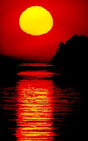
works better if you include some background in your choice.
2. From the Edit pulldown, choose Fill. Select Content-Aware in the dialogue box, and OK.
3. Tah-dah! You may have to work a bit to get this right, but it's still faster than the old way for many images.
In the example photos (Covent Garden, London), I removed the purse on the right using Content-Aware fill. Nearly perfect and so easy!
Modes
Most of the time you'll be working in RGB mode, the default for images from scanners and digital cameras. This is the mode that gives you access to all Photoshop options. But sometimes you'll need something else. Described below are other options.
Grayscale (Choose Mode and Grayscale from the Image pulldown) gives you a black-and-white photo with shades of gray. If your photos will be published in black and white, this is how they'll end up. We noted black and white is much cheaper to print than color, so it's still a popular alternative.
Duotone.Duotone adds a spot color to a black and white picture, with a toning effect. This is a good option to snap up black-and-white photos while still avoiding the cost of process color, see right. Making a duotone with a dark second color gives an impression of a deeper, richer black and white.
To make a duotone (or mono, or tri, or quad) you need to first Grayscale your photo. Then
  1. Choose Duotone from the Mode menu, and Type: duotone from the dialogue box.
  2. Choose the second, white box to the right of Ink Two to bring up the swatch library. (The first color defaults to black.)
  3. Choose a PMS color by scrolling down the rainbow, or just type a number (see illustration at right).
  4. After OKing the color, click on the left of the second color to bring up a histogram. You can adjust the color further.
Duotone dialogue box.Note: Duotones must be saved as EPS files to use the spot colors. Otherwise they may default to CMYK.
CMYK is necessary for final adjustments before printing, as printers use these inks (Cyan-Magenta-Yellow-Black) to print full color photos. (Computers and televisions use the RGB, Red-Green-Blue, color generation process.) Graphic artists normally do all their work in the RGB mode, then convert to CMYK just before sending to a printer. Usually you need to ask the printer first for specifications she needs for the conversion.
bitmap imageSeldom-used modes
Index
color reduces the range of possible colors to 256 based on a Color Look-Up Table. This optimizes the image for faster web display, but is seldom an issue for graphic artists.
Bitmap (see illustration at right) reduces the image to only black or white (line art), so few of Photoshop tools can be applied (Choose Grayscale before Bitmap).
LAB color (Lightness, A channel, B channel) is significant to high-end printers, but not usually part of everyday printing.
Multichannel mode supports spot colors.
Exercise to submit for grading: two photos, one using cloning, healing brush, blur and sharpen, and a second duotone.

Photoshop Lesson Two(b) (An alternative workflow using Camera Raw)

Camera RAW

Most photographers are aware that DSLR cameras can record images in basically two ways. The first, JPG format, is standard domain of compact, or point-and-shoot cameras for casual snapshots. These cameras automatically process the raw data provided by a sensor to produce and image that’s smaller (because it is a “lossy” format that throws out pixels), color-corrected, sharpened, and looks pretty good right out of the camera.
File sizes.The second format, Camera RAW, normally is not available on compact cameras. But it is standard on Digital Single Lens Reflex (DSLR) cameras. Images obtained in RAW contain every pixel of sensor data unmassaged by software. But they look uglier until pulled into an image editor such as Photoshop and “processed” into a form you can use. And they're a lot larger. How much? Take a look at my comparisons on left: CR2 is the Camera Raw format. Many professionals use Camera RAW only for critical images, because dealing with these take time and a lot of space on a camera’s memory card.

Camera Raw in Bridge
Both Photoshop and Bridge have options to bring photographs into the Camera Raw manipulation software. But here’s the thing a lot of people don’t know: you don’t have to use Camera Raw in Bridge or Photoshop only to edit RAW images!

In fact, you can use it to edit JPG (or TIFF, for that matter, another common format), as an alternative to Photoshop’s standard photo editing options.

Why would you want to do this? Some photographers choose it because they think it's easier, faster, and does a better job. I don’t know about that last one, but I do happen to think it’s easier and faster. So why not give it a try?
The workflow procedure below is based on Scott Kelby’s The Adobe Photoshop Book for Photographers. This text includes a treasury of cool techniques—I’d recommend it. But specifically talking about Camera Raw as a photo editing alternative, here are some ideas based on my own experiences as well as Kelby’s.
Camera raw icon.1. First you need to open your (probably) JPG in Camera Raw. If you double-click on a RAW image in Bridge (Adobe’s photo sorting program), it will automatically open in Camera Raw. A JPG will not. The easiest way to open it in Raw is to choose the image in Bridge, and then under the File pulldown, choose Open in Camera Raw. Or you can merely click on the tiny aperture icon at top left of Bridge menu bar, as circled in the illustration (hover over options for descriptions).
2. The sample photo below opened in Camera Raw is typical of those taken with the digital camera’s white balance set on Auto. It’s not quite right. In this case, the photo was taken in shade, so it’s a little blue. We’ll start by fixing the color balance.

White balance original.3. Note a great thing about Camera Raw in Bridge is that all your adjustments are right there in a handy toolbox at the right. White Balance is at the top of the list. Apparently Adobe developers considered that to be the first thing you’d want to correct, because if you have a photo that’s not color corrected, it’s more difficult to get a good read on exposure (darkness/lightness). While I don’t instinctively jump to white balance as Job One, perhaps I should. So let’s.

4. You might begin by wondering if the Camera Raw software is smarter than your eye. Depends; photo adjustment is an art, really, and what looks good to you may not look good to the next shooter. But you can use technology to aid art.

In this case, we can clearly see by the histogram at top that this photo is blue-heavy. What’s more, those dark triangles warn us of clipping in both the highlight and shadow areas. “Clipping” in digital photography is what we used to call blown highlights or blocked-up shadows. That is, paper white or ink black with to detail, no ability to see anything in the light and dark areas.
The ideal photograph contains detail in both highlight and shadow areas, with the exception of a few spectral highlights—the glint off chrome, for example—and black shadows—the keyhole in the door. We do need a little jet black and paper white to give the photo snap. But not too much.

Clipping example.How much clipping do we have in this photo, really? Click once on a triangle at the top of the histogram to find out. It will turn on the clipping areas by showing them in red (or blue for shadows). In fact, this photo shows clipping only the clip--of the pen in Patrick’s pocket. Hardly a problem.

We’re not always so lucky. Take, for example, this image shot in bright backlight. Those red blocks show substantial blown highlights.

But going back to our original bluish image, Let’s correct the color first. You can do this most easily by letting Camera Raw figure it out: Choose Auto from the White Balance flyout menu.

Actually, that’s pretty good. But it is a bit yellow to me. I’m going to move the color Temperature slider down just a little to cool it off slightly. Perfect!

White balance corrected.Slider note: You can go back to the default setting by double-clicking on the slider.

5. Let’s move on to Exposure. We can use Exposure to adjust the highlights (and Blacks to adjust the shadows). We talked about the problem of clipping, that is, blown out highlights. We’re going to take a look at a different image to see a real problem area we have to deal with. In the example below we note the river and sky are nearly paper white, based on the clipping indications. We need detail, particularly in the river. I could try the Auto exposure option, but this time the software isn’t so smart—the highlights get even whiter.

I’m going to try to darken the image by running the Exposure slider to the left. Well, I fixed the clipping, but now the photo is really too dark.

We want to pull back (recover) some of the spectral highlights. Pull the Recovery slider to the right until the image returns to an exposure that looks good to you.

Original and clipping.In theory we’re supposed to pull the Exposure slider until the white clipping warning triangle goes away. In this case, though, I can’t do that, as the sky is just too white. We’ll have to compromise.

6. The shadow areas can be deepened using the Blacks slider. Dragging to the right seems to make the color more saturated—a principle also used in color printing. We add black to snap up (saturate) the other colors. This can really improve a flat photo.
Although it does sap a little detail from the shadows, some of this is an all-right trade-off, if the shadow areas are not significant to the detail of the photo. Below is the adjusted photo, admitting the sky is still pretty light.
Adjusted exposure.7. Kelby has used the comparison of “midtones” in Photoshop’s Levels to explain how the Brightness slider works, and I like that idea. You can use it to add a little snap to the midtone detail, although I don’t use it as much as I do in Photoshop.

8. Clarity is one cool slider, man. It’s kind of like Photoshop's Unsharp Mask, except it doesn’t work in the same way, so you don’t have the possibility of sharpening to annoying graininess. Try Clarity at +40 or so to give those midtones some pizzazz. If your photo has a lot of detail, you can crank it up even higher. Boy, don’t I wish I had something like this in my old darkroom days.

You actually can drag the slider the other way to soften—this is helpful for people’s faces, on which you don’t want to emphasize every little fine wrinkle the way the new HD TVs to cruelly tend to do.


Portraits and Clarity slider.
A workflow example.
Below is a photo in original form, and after adjustments. You may not prefer the final look that I prefer. That's why photography is an art.
Winter fruit adjustments.
9. Backlighting.

Baobob original.Man, I know we’re supposed to use fill-in flash to open up the shadows on backlit images. But what if you don’t happen to remember that? Or worse, happen to be taking a photo of a huge baobob tree that your little fill-in flash just won’t cover?

We could use Photoshop’s Shadow/Highlight adjustment. It’s a bit tricky. Or…we could use the cleverly named Fill Light slider in Camera Raw.

Well, ol' baobab is silhouetted in the setting sun. Obviously lots of clipping going on here in the shadows, as you can see from the histogram. Actually, I deliberately exposed it as a silhouette.
But we do have options. I choose the Auto white balance. Then I cranked on the Fill Light slider to 63. Amazing! Digital photography gives us detail in a detail-less silhouette. If you think the shadows look a little washed out, tweak the Blacks slider to the right a bit.
Baobob with fill light.

10. Contrast.

Adjusting contrast.Contrast is the difference between the dark and light areas of a photo. A contrasty photo is normally taken in sunlight or strong spotlight. A flat photo is normally taken on a cloudy day or under florescent light. (See Ross’s Qualities of Light tutorial). While I don't always work with contrast after dealing with the aspects above, you just might want a contrastier (or less likely, a flatter) photo.

The Contrast slider is one way to achieve that, although not as persnickety as the Tone Curve tool, that second icon from the left next to the camera iris. You can choose the curve and either adjust contrast on your own with the Parametric option and the sliders, or you can use the Point option and drag the curve around as you’d to in Photoshop’s Curves adjustment.

Or! You can choose the Point tab, and on the curve flyout choose a contrast: Medium or Strong. As often is the case, Photoshop may well be smarter than its users.

Final touches

I’m not going to further belabor the Camera Raw image adjustment option, as this is not a full textbook. But I do happen to like it as an alternative to the usual workflow I described in Tutorial Two.
You also can crop and straighten in Camera Raw, fairly straightforward. To accept the crop, click on another tool. To cleara crop, go back to Crop tool, choose Clear Crop.

After you’re, done, you an choose Open Image to open image in Photoshop, or Done to save changes without opening image. If you want to save changes but keep your original (jpgs or tifs), choose Save Image… and save with a new filename.
Try it yourself!
Download this photo. Adjust as indicated above. Try the Fill light slider to bring detail into the near-silhouettes. And straighten it out, using the horizon line tutorial. After practicing with this photo, choose one of your own photos to submit for grading; submit jpg of original, and photo following your work using this Camera RAW feature in Bridge.